
Journal / Launch
We branded our big brother: Be More Purple.
They built the platform. We built the brand, the voice and the marketing site, to the rules of one of the most regulated industries there is.
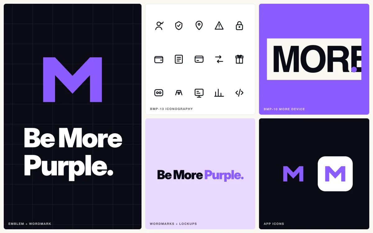
Be More Purple is live at bemorepurple.com (opens in a new tab). They’re our big brother: the tech heads who build the platform underneath regulated iGaming, from identity, wallet and ledger to jurisdiction, payments, casino, sportsbook, risk and the operator tooling that runs them.
The platform is theirs. Everything you see and read when you land there is ours: the brand, the voice, the visuals, the motion and the marketing site that carries it all. This is the story of that side of the launch, and of what it takes to market a business in an industry that reads the small print for a living.
The brief: make it sound like people, not a slot machine
B2B technology in gambling tends to look one of two ways. There’s casino neon, all glow and coins, which tells an operator’s compliance team exactly the wrong thing. And there’s corporate grey, which nobody remembers five minutes after the call.
Be More Purple wanted neither. The line was already on the table: SaaS with Sass. Our job was to make it look and sound true. Serious enough for the people who sign off a platform under a licence, with enough personality that they’d actually want to work with the team behind it.
What we made
A brand that only exists in a logo file isn’t a brand. So we built the whole system, documented it, and then built the site on top of it.
- Brand Bible and Voice Bible. How Be More Purple looks and sounds and, just as important, what it never says.
- The logo system. The M emblem, horizontal and stacked wordmarks, signature and corporate lockups, and app icons, each in purple, white and black.
- The core visual system. A tight palette built around one purple, a near-black and an off-white, and a single type family on a fixed scale, delivered as tokens a developer can drop straight in.
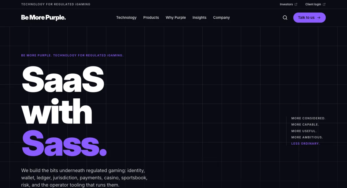
- The MORE device. Six versions of the word that does the heavy lifting: More considered. More capable. More useful. More ambitious. Less ordinary.
- Graphic language and backgrounds. Cuts, frames, ribbons and grids, so every page and slide is recognisably theirs without a logo in sight.
- Iconography. Fifteen icons for the things the platform actually does: KYC, jurisdiction, geolocation, risk, security, wallet, ledger, payments, redemption and more.
- Motion. Written principles and motion tokens, the M Build and Dot Burst animations, and the Purple Code Rain hero, where the falling glyphs spell out real platform operations rather than random code.
- The marketing site. More than 40 pages covering the technology, products, services, insights and company, with each section getting its own share image.
Marketing for an industry that reads the small print
Gambling is one of the most heavily regulated industries you can market in. A brand that sells into it gets read by the same people who read licence conditions: compliance officers, licensing teams, investors doing their diligence. So for Be More Purple the brand rules are commercial rules. These are the ones we built in from day one.
1. No borrowed proof
The inspiration boards were full of the usual shortcuts: fake operator logos, real game titles, uptime figures and jurisdiction counts with nothing behind them, and testimonials from nobody. We used none of it. There are no invented licences, customers, jurisdictions, metrics or prices anywhere on the site. If a claim can’t be traced back to evidence, it doesn’t go live.
2. Say what’s live, and what isn’t
Every capability carries an honest label drawn from Be More Purple’s own catalogue: what’s included, what depends on a provider and what depends on configuration. Products still being built are marked In development, in those words. It’s less flashy than “everything, now”, and far more believable to someone whose job is to check.
3. Say who you are, and who you aren’t
The footer of every page makes it plain: Be More Purple is a technology company, it offers no gambling to the public, and its demos are play money only. In this industry, what you don’t do matters as much as what you do.
4. Ask before you measure
Analytics stays off until a visitor says yes. No tracking loads in the background, and declining is as easy as accepting. Even the cookie banner is written in the brand voice, because there’s no such thing as copy that doesn’t count.

5. Built for everyone who has to use it
Every page was checked against the WCAG 2.2 AA accessibility standard, and the motion steps aside for anyone who has asked their device to reduce it. Accessibility is a regulatory expectation and good manners, and it stops a lovely bit of animation becoming somebody else’s problem.
Where the sass lives
Restraint everywhere else is what buys you room to play. The sass lives in the voice, in the MORE device, in a hero where the code is actually about the product, and in an easter egg we’re not going to tell you about. All we’ll say is it’s purple, and it reigns.
Little brother, big brother
That’s the split, and it works. Be More Purple builds the platform. Underdog builds the brand, the story and everything people actually see. If your brief needs the technology underneath regulated gaming, Be More Purple is who you want. If it needs a brand that can stand up in a room full of compliance officers and still get noticed, that’s us.